
A real report, captured
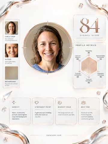
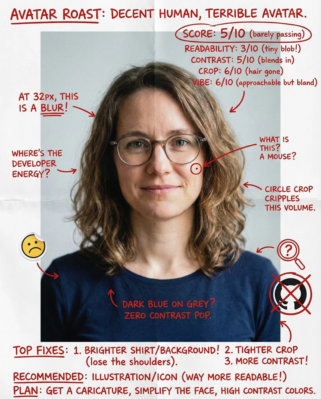
Oh, this is a genuinely lovely studio headshot — soft, flattering light, eyes looking straight down the lens at you, and a backdrop so clean it politely gets out of the way. The only thing holding it back on GitHub is that the crop is a touch too generous: pull in tighter and that warm, capable face will still read at thumbnail size instead of shrinking away beside the commits.
Where this photo works
This photo is a real win for the surfaces where a human face builds trust: the GitHub profile page itself, team/org pages, conference speaker cards, maintainer bios, and any OSS context where 'there's a real person behind this repo' matters. It holds up on both light and dark UI because the pale ground and the deep navy shirt sit on opposite ends of the tonal scale, so the circle never dissolves into either theme. Where it struggles is the smallest placement GitHub uses — the 16–32px mark beside issues, commits and review comments. At that size the face collapses to a handful of pixels, the wavy hair becomes the loudest shape in the circle, and it can't compete for instant recognition with a bold illustrated logo or a high-contrast mark in a busy feed.
Quickest fixes
- Re-crop to a square centred on the eyes with the face filling about 65–70% of the circle height
- Lift skin warmth by a few points and micro-contrast by 5–8% so features survive the downscale
- Protect and slightly brighten the catchlights so the eyes stay alive at 32px
Retake plan
- 1.Move in roughly a foot or switch to a tighter focal length so the head fills about two-thirds of the frame height — head-and-shoulders only, no torso.
- 2.Keep the same soft key slightly camera-left at eye height with white fill opposite; leave the seamless backdrop exactly as it is.
- 3.Raise the smile one notch — a relaxed half-smile with engaged cheeks — and hold it for a beat so the eyes stay soft rather than squinting.
- 4.Shoot three frames with the chin angled a touch toward the lens to reduce the under-chin shadow and lengthen the neck line.
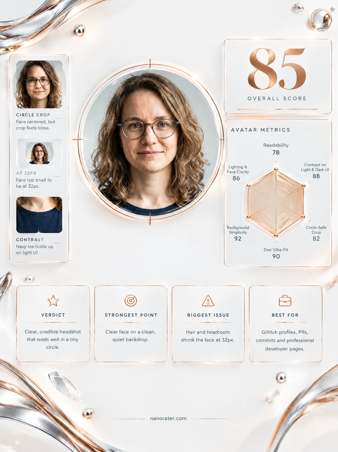
- Small-Size Readability (16–64px)78
Face width is roughly 28% of frame width; at 32px the face renders around 9–10px wide, and the eye/glasses detail compresses into a few pixels. The visible glasses and the hair silhouette do give the shape a recognisable outline.
- Contrast & Simplicity88
Deep navy shirt against a pale gray seamless ground creates two clearly separated tonal masses; the mid-brown hair sits between them. No props, no text, no clutter — the frame reads as a single subject on a plain field.
- Circle Crop Safety80
The subject is horizontally centred and the head sits above the vertical midpoint, so a centre square crop lands the chin near the middle. The wide hair mass and the shoulders reach toward the frame edges and would be the first things a tight circle clips.
- Vibe Fit — Approachable, Credible Dev Energy88
Round glasses, plain tee and calm direct gaze read as competent and low-drama — the register of a senior maintainer rather than a personal-brand performance. Nothing flashy, nothing awkward.
- Expression Energy80
A subtle closed-mouth smile with the eyes engaged and gaze straight to camera. Warm but reserved; the smile corners lift gently and the lower face stays fairly still, so it reads as composed rather than animated.
- Lighting & Face Clarity90
Single soft key from camera-left at eye height with fill, producing gentle modelling on the cheek and a soft under-chin shadow. No blown highlights, no hot speculars on the lenses, both eyes visible and bright.
- Background Separation92
Seamless pale gray backdrop with subtle falloff and a faint soft shadow behind the camera-left shoulder; the subject sits clearly in front of it with no competing shapes or lines.
- Tonal Palette & Wardrobe87
A cohesive three-part palette: warm sandy-brown hair and skin, cool pale gray ground, deep navy shirt. The navy anchors the bottom of the circle and keeps the avatar from floating on light themes.
- Detail Retention When Downscaled82
Glasses frames and iris colour survive at moderate sizes, but at 16–24px the frame edges, catchlights and brow line begin to fuse, leaving only a soft face shape and hair mass.
- Light/Dark UI Versatility85
Pale ground, mid-tone subject and dark shirt give three distinct value bands, so the circle separates on both white and near-black interfaces; on dark UI the bright ring reads as a deliberate halo rather than a glow.
What works
- Flattering soft key with clean, unmuddied modelling
Light falls from camera-left with even fill, no blown skin highlights, no lens flare, and a gentle shadow under the jaw that keeps the face dimensional.
- Disappearing backdrop isolates the subject
A seamless pale gray ground with soft falloff and no props, edges or texture competes with the face.
What holds it back
- Face scale is small for GitHub's tiniest placements
Head height is roughly 45% of frame height and face width around 28%, leaving generous ground around the hair and shoulders; at 32px the features compress to roughly 9–10px.
- Reserved expression reads composed rather than magnetic
Closed-mouth smile with a still lower face and relaxed eyes; friendly and credible, but it does not add stop-and-look energy in a feed of bolder avatars.