
TikTok PFP Rater
Choose a preset
Step 1Input
Max 5MB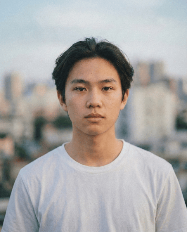
Output
Your annotated result will appear here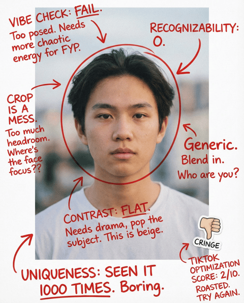
What this tool does
TikTok is fast. Your PFP must be bold, readable, and instantly “you.” This tool focuses on contrast, expression, and distinctiveness to improve click-through.
Avatar is readable at tiny size and in motion.
Expression is high-energy or signature (fits your niche).
Contrast is strong (subject separates from background).
Crop is tight: face or icon dominates.
Color choice is distinctive (one strong accent works).
Background is simple or stylized, not random clutter.
No confusing details (tiny text, complex patterns).
Matches your on-camera identity and content tone.
How to use (get better results)
Follow these steps to increase feedback accuracy.
Upload your current TikTok PFP.
Try a version with tighter crop and higher contrast.
Pick one “signature” expression or pose and reuse it.
Use a simple background or a brand color backdrop.
Preview at small size on a phone (dark + light mode).
Avoid text; rely on face/icon instead.
Keep it consistent across platforms if you’re building a brand.
Scoring rubric (how we judge a good photo)
Each dimension maps to actionable improvements.
Readability
Recognizable in a tiny circle and in fast feeds.
Energy
Expression matches TikTok’s high-tempo vibe.
Distinctiveness
Not generic; memorable color/pose.
Contrast
Strong separation from background.
Brand fit
Matches your niche and content identity.
Consistency
Works with your overall visual system.
Do / Don't
Quick pitfalls checklist for faster improvements.
- Use a bold crop and make the face/icon large.
- Choose one signature expression (smirk, surprise, etc.).
- Use a simple high-contrast background.
- Add one accent color to be memorable.
- Keep sharpness and clarity high.
- Test on phone at small size before committing.
- Keep it consistent for weeks to build recognition.
- Don’t use low-contrast, washed-out photos.
- Don’t use busy backgrounds or tiny text.
- Don’t crop wide with lots of empty space.
- Don’t choose an expression that contradicts your niche.
- Don’t switch styles every few days.
- Don’t use heavy filters that make you unrecognizable.
- Don’t rely on logos with unreadable detail.
Who it's for
Creators optimizing for profile click-through.
Accounts that need a recognizable “character” image.
People whose current PFP looks boring or generic.
Users running multiple accounts and needing differentiation.
Livestreamers who need quick recognizability.
Brands/shops using a human face as trust signal.
Who it's not for
- If you need a calm professional image (use LinkedIn/CV tools).
- If you want minimal contrast muted aesthetics (IG may fit better).
- If your content identity is not visual (e.g., faceless brand).
- If you can’t retake or adjust crop/contrast at all.
- If you want strict ID compliance.
- If you want a full tutorial on graphic design.
Related rating tools
Explore adjacent tool pages with similar search intent and compare how the rating criteria change by scenario.
School ID Photo Rater
Make your school ID photo clean, friendly, and compliant. Checks background, lighting, face visibility, and crop—then gives a simple retake setup so you look awake and pass admin checks.
Cosplay Photo Rater
AI-rates your cosplay photo for character accuracy and visual impact. Checks silhouette, pose, expression, lighting mood, and props—then gives one stronger pose and framing fix.
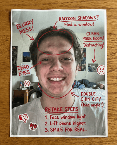
Selfie Rater
Upload a selfie for blunt persona annotations on angle, light, expression, and background. Get fast retake steps that improve clarity and vibe.
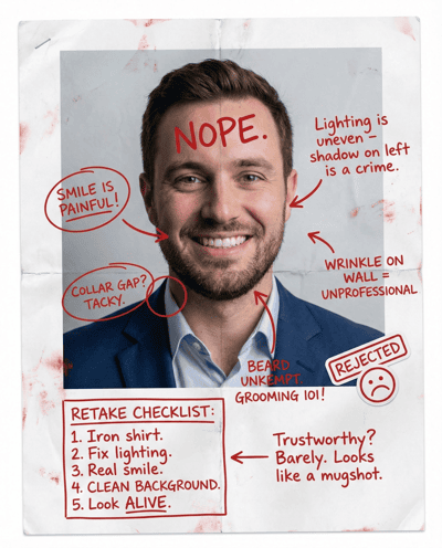
LinkedIn Headshot Rater
AI-rates your LinkedIn headshot for trust and polish. Flags lighting, background, grooming, outfit, and crop issues—then gives a clear retake checklist.
Dating Photo Rater
Rate my dating photo with AI. Get feedback on attraction, approachability, and profile-photo effort, plus 1–2 retake ideas that usually improve matches.
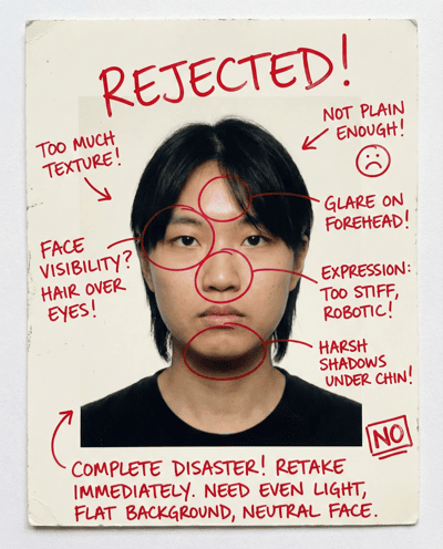
Passport Photo Rater
Check your passport-style photo for compliance and rejection risks. Flags background, shadows, glare, expression, and framing—then suggests a safe retake setup.
FAQ
Rate more photos with different personas
Upload one photo, switch personas, and iterate fast.